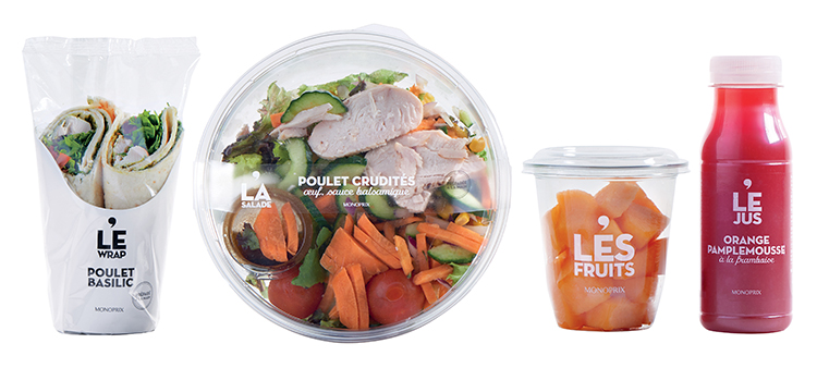
 Monoprix food to go
GOLD
Brand: Monoprix food to go
Retailer: Monoprix
Country: France
Category: B2. Redesigned Brand
Agency: Brandimage – Desgrippes & Laga
Summary:
Challenge: reposition a food to go line for busy urbanites that reflects what Monoprix is all about.
Fresh, high-quality, healthy, and practical food to go products that are as appealing as they are tasty, all day long.
We translated the brand’s ambition into a transparent, sleek design which focuses on the quality ingredients and simple recipes. The commitments of Monoprix appear on the labels stating “Prepared by hand” on sandwiches and salads and “Fruits picked at their peak” on fruit salads.
The graphic identity is a trilogy of sorts: font styles reflecting modern elegance, the brand’s iconic apostrophe placed at the center to highlight selected products, a simple and effective black and white color code.
A single tone runs through the entire ultra-minimalist, direct and affordable line that includes fresh sandwiches, salads, fresh-squeezed juices and desserts to go.
Monoprix’s identity comes through effectively in a chic and trendy way.
Credits:
- Elie Hasbani – Creative Director
- Elodie Loisiel – Art Director
- Marine Guillou – Client Director

