SILVER
ASDA CHOSEN BY YOU
Category: Fresh
Retailer: Asda Stores Ltd
Country: United Kingdom
Agency: Brandhouse
The problem:
When the Asda fish range was relaunched, in-depth research with ASDA mum’s revealed their lack of confidence and understanding of fresh fish.
The current design that featured one “seascape” visual wasn’t appealing, and clear plastic packaging wasn’t showing the product off in a favorable way. Plus within the breaded fish range, both product and labels were virtually identical, so differentiation within the range was also very important.
Objectives of the brief:
To focus around bringing out the helpfulness of the fishmonger and freshness of fish cues, plus increasing taste appeal across a very varied product range. Making fish an easy tasty meal for Asda Mums
The Solution:
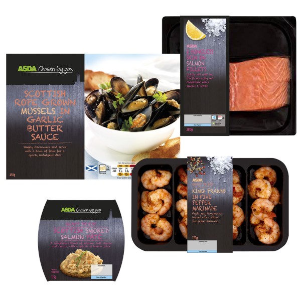
The design brings to life the aluminum and crushed ice fishmonger cues to communicate freshness, with a really simple and inspiring ingredient depiction that helps the Asda Mum visualize the tastiness of a cooked meal.
The language and tone of voice used reflects helpfulness, with cooking hints and tips for mum that show how simple cooking with fish can be.
Black trays were also introduced to enhance the overall appeal by showing off the raw product at its best, adding premium cues and, together with clearly differentiated labels improving standout on-shelf and making the fixture easier to shop.
ASDA:
Design Manager: Jim Scott
BRANDHOUSE:
Creative Director: Bronwen Edwards
Senior Designer: Mark Whittle
Artworker: Oliver Young
Photographer: Ivor Innes Photography

