 ANTO’
ANTO’
Category: Packaged Goods
Retailer: IFW
Country: Italy
Agency: Casa Rex
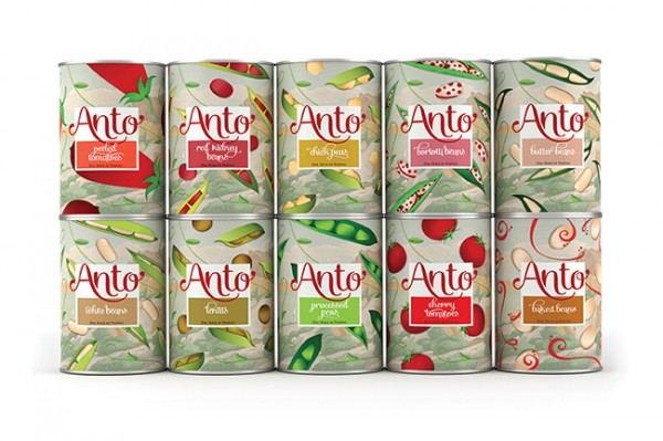
Package design has a tendency to be very predictable with layouts and shapes that follow traditional standards. Private brand package design tends to be even more predictable with far too many retailers either continuing to copy national brands or simply copying their retail competitors. Italian retailer IFW’s ANTO’ adopts the traditional conventions and makes them beautiful. They have adopted a style and grace that is ownable and unique, and ultimately made them one of the Gold Vertex award winners in the Packaged Goods category. That style and grace made them a stand out brands and our Publisher’s Choice winner.
BACKGROUND:
The objective here was to renew Anto’s visual, creating a more contemporary packaging without losing its Neapolitan identity.
The brand lost its previous bland yellow color and now reveals its true Neapolitan essence through vibrant illustrations depicting its natural ingredients, which are playfully scattered across the bay of Naples. The new visual is combined with a new color palette and calligraphic signature – incorporating its traditional aspects with fresh new artisanal touches.
This blend of traditional and contemporary aesthetics gave Anto’s a unique and sophisticated identity that truly captures the spirit of its Neapolitan authenticity as well as premium quality.
CREDITS:
Creative Director: Gustavo Piqueira
Design: Gustavo Piqueira, Samia Jacintho, Ingrid Lafalce
Assistant Designers: Lilian Meireles

